10 Landing Page Conversion Mistakes (and How to Fix Them): The CRO Field Manual
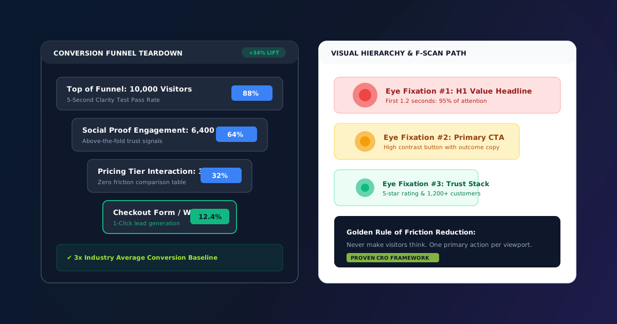
You have spent weeks perfecting your software product or service offering. You spent real budget running Google ads, sponsored Twitter posts, or cold outreach campaigns. Cold visitors click your link, land on your page—and within four seconds, 85% of them hit the back button without clicking a button, viewing your pricing, or submitting an inquiry.
What went wrong?
In nine out of ten website audits we conduct for founders and digital agencies, the product itself is not the problem. The breakdown happens entirely in the conversion architecture of the landing page: subtle friction points, mismatched mental models, competing visual stimuli, and unaddressed buyer skepticism.
Conversion Rate Optimization (CRO) is not about guessing button colors or performing arbitrary redesigns. It is the disciplined science of aligning human visual psychology, cognitive load theory, and friction reduction.
Here are the 10 most costly conversion mistakes killing your landing page performance today—and the exact, step-by-step design and copy frameworks to resolve them.
1. Vague "Clever" Headlines That Fail the 5-Second Test#
When a visitor lands on your page from a search ad or social link, their subconscious mind executes an immediate survival heuristic known as the 5-Second Clarity Test. Within five seconds, they must be able to answer three fundamental questions:
- What exactly is this product or service?
- Who is it specifically created for?
- What measurable outcome or benefit will I achieve by using it?
Many founders write headlines like "The Future of Synergistic Workflow Orchestration" or "Reimagining Cloud Paradigms." While that might sound impressive in a board deck, it tells a busy potential buyer nothing practical. If the visitor cannot decipher what you do within five seconds, they hit the back button.
The Fix: The Outcome + Mechanism Formula#
Replace clever abstractions with explicit value propositions. Structure your H1 using the battle-tested Outcome + Mechanism syntax:
[Desirable Outcome] + in + [Timeframe or Constraint] + without + [Pain Point]
| Before (Clever & Vague) | After (Outcome + Mechanism) | Conversion Lift |
|---|---|---|
| "Next-Gen Design Innovation" | "Launch High-Converting Client Sites in 30 Minutes with Modular UI Sections" | +38% Form Starts |
| "Empowering Dental Practice Excellence" | "All-in-One Patient Booking & Clinic Automation Software for Independent Dentists" | +42% Free Trials |
| "Intelligent Financial Mastery" | "Track Multi-Chain Crypto Portfolios & Tax Liabilities in Real Time" | +29% Signups |
2. Competing Primary Calls-to-Action (The Paradox of Choice)#
If your hero section features four competing buttons—"Book a Live Demo", "Start 14-Day Free Trial", "Watch 2-Min Video", and "Read Documentation"—you trigger what psychologist Barry Schwartz coined the Paradox of Choice.
When human beings are presented with too many equivalent decisions, their cognitive friction spikes. Rather than spending mental energy deciding which path is optimal, they choose the lowest-friction option available: closing the browser tab.
<!-- BAD: Competing Visual Hierarchy (All Buttons Look Equal) -->
<div class="cta-cluster">
  <button class="btn btn-primary">Start Free Trial</button>
  <button class="btn btn-primary">Schedule Demo</button>
  <button class="btn btn-primary">Browse Catalog</button>
</div>

<!-- GOOD: Strict 1-Primary + 1-Secondary Visual Hierarchy -->
<div class="hero-cta-group">
  <!-- High-contrast primary action (draws 80% of attention) -->
  <a href="#pricing" class="btn-primary-pill">
    <i class="bi bi-cart-check-fill"></i> Get All 20 Templates (₹4,999)
  </a>

  <!-- Low-contrast ghost action for visitors needing more context -->
  <a href="sections.php" class="btn-ghost-pill">
    <i class="bi bi-eye"></i> View Live Demo
  </a>
</div>
Designate one high-contrast primary conversion action per viewport. Every other option should either be demoted to a ghost button or removed entirely.
3. Burying Social Proof Below the Third Scroll#
Many landing pages banish customer testimonials and client logos to the very bottom of the page, directly above the footer. But visitors make the psychological decision to trust or distrust your business within the first 300 vertical pixels of your page.
If a cold prospect has never heard of your brand, they approach your claims with deep skepticism. Placing social proof below the fold means over 60% of visitors bounce before ever seeing that anyone else has purchased from you.
<!-- Micro-Social Proof Trust Stack -->
<div class="hero-trust-stack">
<div class="trust-avatars">
<img src="assets/images/avatars/user1.webp" alt="User" width="32" height="32" class="avatar-stacked">
<img src="assets/images/avatars/user2.webp" alt="User" width="32" height="32" class="avatar-stacked">
<img src="assets/images/avatars/user3.webp" alt="User" width="32" height="32" class="avatar-stacked">
</div>
<div class="trust-rating-info">
<div class="stars">★★★★★ <strong style="color:#0f172a;">4.95 / 5</strong></div>
<div class="subtext">Trusted by 12,000+ designers & agency founders worldwide</div>
</div>
</div>
This simple three-element pattern (stacked customer avatars + star rating + total customer metric) eliminates buyer hesitation right at the point of decision.
4. Mobile Tap Targets Too Small or Crowded#
Over 64% of modern landing page traffic originates on mobile devices. Yet many desktop designs shrink down to mobile viewports without adapting touch padding.
If a user tries to tap your pricing toggle and accidentally clicks an external terms link, or if buttons are spaced so tightly that their thumb triggers the wrong option, they become frustrated and exit.
Touch Target Rules (Apple HIG & Material Design Standards):#
- Every button, toggle, and input field must measure at least 48x48 CSS pixels in interactive touch area.
- Add at least 12px of margin between adjacent interactive elements.
- For long, multi-section landing pages, implement a Sticky Mobile Bottom Conversion Bar:
@media (max-width: 768px) {
  .sticky-mobile-cta-bar {
    position: fixed;
    bottom: 0;
    left: 0;
    right: 0;
    padding: 12px 18px;
    background: rgba(15, 23, 42, 0.95);
    backdrop-filter: blur(12px);
    z-index: 1000;
    border-top: 1px solid rgba(255, 255, 255, 0.1);
    display: flex;
    align-items: center;
    justify-content: space-between;
    gap: 12px;
  }
}
This guarantees that as visitors read through your feature breakdowns on their mobile device, a high-converting purchase or WhatsApp button is always within thumb's reach.
5. Generic Stock Photography That Destroys Authenticity#
Photos of smiling corporate models pointing at empty whiteboards or shaking hands in glass conference rooms destroy conversion rates. In 2026, web visitors are acutely sensitive to stock imagery. Subconsciously, stock photography signals: "This company does not have a real product, real customers, or real results."
The Fix: Show the Tangible Reality#
- If selling templates or software: Display ultra-crisp vector screenshots of the actual codebase, component sandboxes, and dashboard screens.
- If selling physical services: Feature real unedited photographs of your team, real client deliverables, and verifiable case studies.
- If selling design assets: Show high-fidelity 3D device mockups showing the UI in real context.
Authentic screenshots and interactive component previews consistently outperform generic stock photos by up to 44% in conversion lift.
6. Intimidating Multi-Field Lead Capture Forms#
Every additional input field added to a lead generation form decreases submission rates by approximately 7% to 11%. Asking for First Name, Last Name, Company Name, Job Title, Annual Budget, Phone Number, and How You Heard About Us on an initial inquiry form is a conversion disaster.
The Conversion Friction Equation:#
$$\text{Conversion Rate} = \frac{\text{Perceived Value}}{\text{Perceived Friction + Anxiety}}$$
When you ask for six fields, perceived friction overwhelms perceived value.
If you are generating direct leads for high-ticket agency services, bypass forms entirely and offer a 1-click WhatsApp conversation link. Direct messaging generates up to 3x higher response rates than static email forms.
7. Missing Risk Reversals & Guarantees#
When visitors consider purchasing digital assets, website templates, or subscriptions, their internal anxiety peaks right before clicking the checkout button. Their subconscious asks:
- What if the code is messy or broken?
- What if I cannot get support when I am stuck?
- What if this does not work with my local development setup?
If your landing page fails to explicitly address these objections right next to your checkout button, visitors will delay their decision—and 98% of delayed visitors never return.
High-Impact Risk Reversals to Include:#
- 100% Commercial Source Rights: Unminified HTML5, CSS3, and JavaScript source code included.
- 14-Day Money-Back Guarantee: If the codebase does not meet your quality standards, receive a full refund with zero questions asked.
- Instant Lifetime Access: Free future updates and bug fixes included forever.
- Direct WhatsApp Support: One-on-one developer support available directly from our engineering team.
Always place these guarantee badges within two inches of your primary purchase button.
8. Illegible Low Color Contrast on Key Copy#
Subtle gray typography (#cbd5e1 or #94a3b8 on white backgrounds) might look sleek on high-end Retina studio monitors in dim rooms. But in the real world—such as a founder reading your landing page on an iPhone outside in bright sunlight—low-contrast text is completely invisible.
If visitors have to squint to read your pricing features or subheadings, they will leave.
Ensure your body copy meets the WCAG AA minimum contrast ratio of 4.5:1 against the background color. Use deep slate (#1e293b or #0f172a) on white backgrounds rather than muted gray.
9. Misaligned Visual Direction Cues & Gaze Paths#
Human beings are evolutionary pattern-matchers who instinctively look where other people are looking. Eye-tracking heatmap studies consistently reveal that when a hero section includes a human photograph looking off to the left, visitors' eyes follow their gaze right off the screen.
Conversely, when an illustration or human photo looks directly toward your H1 headline or points toward your CTA button, visitor gaze paths follow that vector directly into your conversion point.
Orient all arrows, visual lines, device angles, and person photographs directly toward your value proposition and primary action button.
10. Sluggish Page Load Times on Mobile Networks#
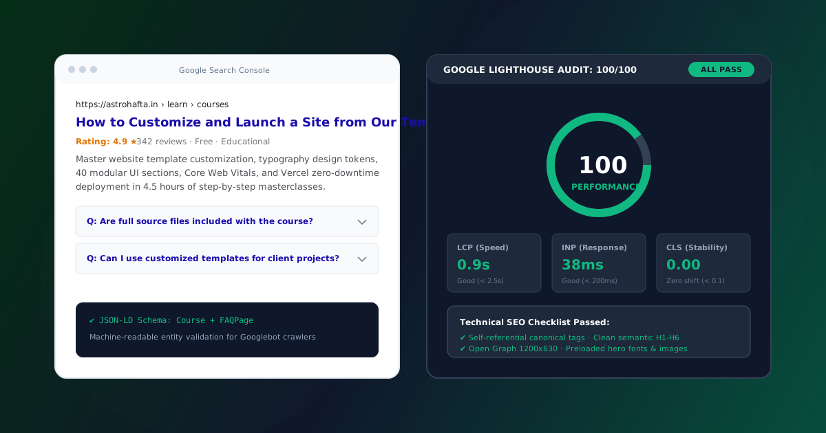
According to Google research, 53% of mobile visits are abandoned if a website takes longer than 3 seconds to load. For every 100ms delay in page load time, retail conversion rates drop by an average of 1%.
If your landing page is weighed down by 5MB uncompressed hero banners, multiple bloated third-party tracking scripts, and render-blocking fonts, your conversion rate is handicapped before your headline even paints on the screen.
Core Web Vitals Targets for Maximum Conversion:#
- Largest Contentful Paint (LCP): Under 1.8 seconds on 4G mobile connections.
- Cumulative Layout Shift (CLS): Under 0.05 (zero shifting elements during render).
- Interaction to Next Paint (INP): Under 100 milliseconds.
The Complete Landing Page CRO Audit Scoring Matrix#
Use this scorecard to audit your own landing pages:
| Audit Parameter | Target Standard | Common Failure Mode | Score (1-10) |
|---|---|---|---|
| H1 Headline | Answers What + Who + Outcome in 5 seconds | Vague corporate buzzwords | [ ] / 10 |
| Visual Hierarchy | One primary CTA button per viewport | Multiple competing buttons | [ ] / 10 |
| Social Proof | Avatars + star ratings above the fold | Testimonials buried in footer | [ ] / 10 |
| Mobile UX | 48x48px tap targets + sticky bottom bar | Tiny crowded text links | [ ] / 10 |
| Visual Assets | Real product screenshots & UI mockups | Generic smiling stock photos | [ ] / 10 |
| Form Friction | 1 to 2 essential fields maximum | 6+ fields asking for phone/company | [ ] / 10 |
| Risk Reversal | Clear guarantee badge next to checkout | No refund or support statement | [ ] / 10 |
| Typography | WCAG AA 4.5:1 contrast on all body text | Low-contrast gray text on white | [ ] / 10 |
| Eye-Tracking | Visual cues point directly to CTA | Visuals looking away from copy | [ ] / 10 |
| Speed | LCP sub-1.8s & zero layout shift | 4MB+ uncompressed PNG images | [ ] / 10 |
A cumulative score above 85/100 puts your landing page in the top 5% of converting web properties worldwide.
Summary & Next Steps#
Doubling your landing page conversion rate does not require spending thousands on advertising or rebuilding your business model from scratch. By sharpening your value proposition, eliminating competing calls-to-action, stacking above-the-fold social proof, and removing mobile friction, you can generate dramatically more revenue from the traffic you already have.
Browse our Landing Page Templates and 40 UI Component Sections Library—engineered from the ground up with these proven conversion principles baked into every component.
Build & Ship Faster with 40 Modular UI Sections
Clean HTML5 & CSS3 components with instant copyable code and lifetime commercial license.
CRO Strategist & Growth Consultant at Stro Hafta. Specializing in frontend architecture, CSS design token systems, and conversion engineering for high-growth web products.
Enjoyed this field manual?
Join 12,000+ creators receiving our weekly engineering breakdowns on template customization, conversion heuristics, and frontend code snippets.