Starting a new web development project from a blank text editor is one of the most deceptive traps in modern software engineering. You begin with ambitious enthusiasm, but within three hours you find yourself wrestling with CSS grid breakpoints, setting up bundler configs, writing boilerplate navigation menus, and debugging mobile hamburger drawer animations—long before you have written a single sentence of compelling sales copy.
Production website templates eliminate this friction entirely. Instead of reinventing standard layouts from scratch, you begin at the 80% mark with fully responsive navigation systems, accessibility-tested components, and verified mobile layouts.
However, many designers and junior developers make the mistake of modifying templates haphazardly. They dive directly into individual HTML elements, override random CSS selectors with !important, or spend days fighting against an existing codebase.
In this comprehensive, production-tested guide, we will walk through the Tokenized Customization Framework that allows our engineering team and top agency partners to take any Stro Hafta template codebase and transform it into a distinct, high-converting client site or startup landing page in under 30 minutes.
1. Project Anatomy & Folder Structure#
Before altering a single line of CSS, take two minutes to inspect how modern, modular template architectures are organized. When you download a template codebase from Stro Hafta (such as NovaPulse, FitPulse, or ClinicaPro), you will find a clean, zero-bloat file hierarchy:
my-client-project/
├── index.php (or index.html)   # Main semantic page layout
├── about.php                   # Secondary interior pages
├── contact.php                 # Lead capture & contact page
├── assets/
│   ├── css/
│   │   ├── style.css           # Core styling & CSS design tokens
│   │   └── components.css      # Isolated UI section classes
│   ├── js/
│   │   ├── main.js             # Mobile drawer, accordions, and modals
│   │   └── animations.js       # Micro-interactions & scroll triggers
│   ├── images/
│   │   ├── hero/               # Optimized hero graphics & mockups
│   │   ├── clients/            # SVG monochrome partner logos
│   │   └── avatars/            # Testimonial author headshots
│   └── downloads/              # Deliverable PDFs & cheat sheets
└── database/                   # Ready-to-import SQL dumps (if dynamic)
Separation of Concerns: Notice that our templates do not bundle heavy runtime JavaScript frameworks like React, Vue, or Webpack by default. Everything is built with lightweight vanilla JavaScript and native CSS Custom Properties (var(--...)). This ensures sub-second page loads and guarantees that your client can host the site on any basic server, Vercel, or shared cPanel hosting without running npm build errors.
2. Global Token Engineering in the :root Element:root Element">#
Every visual aspect of a modern website—brand colors, typography scales, border radii, card elevation shadows, and spacing gutters—should be driven by a single source of truth: the CSS :root selector.
Open assets/css/style.css and locate the token configuration block at the very top of the stylesheet:
:root {
  /* ========================================================
     1. BRAND COLOR PALETTE TOKENS
     ======================================================== */
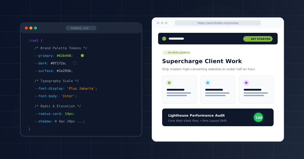
  --primary: #82b440;                 /* Core brand color for primary CTAs */
  --primary-hover: #719e35;           /* Hover & active button state */
  --primary-subtle: rgba(130, 180, 64, 0.12); /* Badge & pill backgrounds */

  --dark: #0f172a;                    /* Deep dark slate for headers & dark surfaces */
  --dark-surface: #1e293b;            /* Secondary card surfaces in dark mode */
  --text-main: #1e293b;               /* High-contrast body text */
  --text-muted: #64748b;              /* Secondary subheadings and metadata */
  --border-color: #e2e8f0;            /* Crisp card and table dividers */
  --bg-page: #f8fafc;                 /* Base ambient canvas tone */

  /* ========================================================
     2. TYPOGRAPHIC TOKENS
     ======================================================== */
  --font-display: 'Plus Jakarta Sans', -apple-system, sans-serif;
  --font-body: 'Inter', -apple-system, BlinkMacSystemFont, sans-serif;
  --font-mono: 'Fira Code', Consolas, monospace;

  /* ========================================================
     3. COMPONENT RADII & ELEVATION SHADOWS
     ======================================================== */
  --radius-sm: 6px;                   /* Badges, tags, and small tooltips */
  --radius-md: 14px;                  /* Content cards, inputs, and buttons */
  --radius-lg: 24px;                  /* Large hero containers & modal dialogs */

  --shadow-subtle: 0 2px 8px -2px rgba(15, 23, 42, 0.06);
  --shadow-card: 0 4px 20px -2px rgba(15, 23, 42, 0.08);
  --shadow-hover: 0 12px 32px -4px rgba(15, 23, 42, 0.14);
}
The 80/20 Customization Rule: Changing only three tokens—--primary, --dark, and --radius-md—will instantly restyle over 80% of your website. Buttons, navigation links, hero pills, pricing table borders, and footer accents adapt simultaneously with zero manual overrides.
Color Contrast & WCAG AA Verification#
When choosing your primary brand color, verify that your text colors satisfy the Web Content Accessibility Guidelines (WCAG 2.1 AA). White text on your primary button requires a minimum contrast ratio of 4.5:1 for standard text and 3:1 for large display text.
If your client's brand color is a bright energetic yellow or lime, you should set button text to --dark (#0f172a) rather than white to maintain crisp, effortless legibility.
3. Font Pairing & Zero-CLS Typography#
Typography establishes your website's personality before a visitor reads a single sentence. Upgrading default system fonts to a distinctive typographic pairing instantly elevates perceived value.
Recommended Google Font Pairings for Modern Web Products#
| Brand Aesthetic | Heading Font (--font-display) | Body Font (--font-body) | Best Suited For |
|---|
| Modern AI SaaS & Tech | Plus Jakarta Sans (800 Bold) | Inter (400 / 500) | Software, APIs, Dashboards |
| Luxury & High-Ticket | Playfair Display (700) | Plus Jakarta Sans (400) | Real Estate, Jewelry, Fine Dining |
| Energetic & Fitness | Outfit (800 Heavy) | Inter (500) | Gyms, Sports, Creator Brands |
| Corporate & Fintech | Syne (700 Bold) | Manrope (400 / 600) | Web3, Venture Capital, Law Firms |
To load your fonts without degrading Core Web Vitals, paste the preconnect tags inside the
<!-- Preconnect to Google Fonts domain to reduce DNS lookup latency -->
<link rel="preconnect" href="https://fonts.googleapis.com">
<link rel="preconnect" href="https://fonts.gstatic.com" crossorigin>
<link href="https://fonts.googleapis.com/css2?family=Inter:wght@400;500;600&family=Plus+Jakarta+Sans:wght@700;800;900&display=swap" rel="stylesheet">
Then map them directly to your CSS selectors:
h1, h2, h3, .brand-logo, .hero-title {
  font-family: var(--font-display);
  letter-spacing: -0.025em; /* Tight optical tracking for display text */
  color: var(--dark);
}

body, p, input, select, textarea, button {
  font-family: var(--font-body);
  color: var(--text-main);
  line-height: 1.65;
}
Notice the letter-spacing: -0.025em; rule on headings. High-end design agencies always apply slight negative letter-spacing to large geometric sans-serif headings to give them that tight, editorial polish.
4. Swapping and Reordering Modular UI Sections#
One of the most powerful capabilities of the Stro Hafta ecosystem is full compatibility between our 20 Website Templates and our 40 UI Sections Library.
If your template codebase features a standard 3-column feature grid, but your client requires an interactive Bento Grid with an embedded video preview, you can simply grab the section code and drop it into your HTML:
<!-- ========================================================
     MODULAR COMPONENT: 3-COLUMN BENTO GRID FEATURE SECTION
     ======================================================== -->
<section class="section-py bg-surface" id="features">
  <div class="container">
    <div class="section-header text-center">
      <span class="badge-pill">MODULAR CAPABILITIES</span>
      <h2 class="section-title">Engineered for Rapid Scaling</h2>
      <p class="section-subtitle">Everything you need to deliver production-ready client websites in days, not weeks.</p>
    </div>

    <div class="bento-grid">
      <!-- Feature Card 1 (Span 2 Columns) -->
      <div class="bento-card bento-span-2">
        <div class="bento-icon"><i class="bi bi-lightning-charge-fill"></i></div>
        <h3>Zero-Configuration Edge Deployment</h3>
        <p>Deploy worldwide in seconds with automatic SSL certificates and automated Git-based webhooks.</p>
        <div class="bento-graphic">
          <img src="assets/images/features/deploy-visual.webp" alt="Instant Deployment UI" loading="lazy" width="480" height="260">
        </div>
      </div>

      <!-- Feature Card 2 (Standard Column) -->
      <div class="bento-card">
        <div class="bento-icon"><i class="bi bi-shield-check"></i></div>
        <h3>100% Commercial Source Rights</h3>
        <p>Full unminified source code with lifetime commercial license included for unlimited projects.</p>
      </div>

      <!-- Feature Card 3 (Standard Column) -->
      <div class="bento-card">
        <div class="bento-icon"><i class="bi bi-palette-fill"></i></div>
        <h3>CSS Token Architecture</h3>
        <p>Rebrand typography, radii, and color palettes across 40 components in under five minutes.</p>
      </div>
    </div>
  </div>
</section>
Avoid CSS Specificity Collisions: When pasting new UI sections from our 40-section library, keep all layout sizing controlled via container classes (.container, .section-py). Never write raw global selectors like div { margin: 20px; } or section { padding: 40px; }—always use modular component prefixes to protect existing pages.
5. Media Pipeline & Lead Generation Wiring#
Never launch a template with uncompressed PNGs or dead placeholder buttons. The final 10 minutes of your 30-minute sprint should focus on asset hygiene and conversion plumbing.
1. Image Optimization Pipeline#
Unoptimized images are the single biggest cause of slow mobile websites. Convert all hero graphics, screenshots, and avatars to the modern WebP or AVIF format:
- Hero background images: Keep file size under 160 KB.
- Component UI mockups: Keep file size under 75 KB.
- Testimonial author headshots: Keep file size under 20 KB.
Always declare explicit width and height dimensions on ![]()
<img src="assets/images/hero-mockup.webp"
     width="600"
     height="380"
     alt="Supercars Dashboard Analytics Interface"
     class="hero-mockup-img"
     loading="eager"
     fetchpriority="high">
Notice fetchpriority="high" and loading="eager" on the hero image. This instructs the browser engine to prioritize the Largest Contentful Paint (LCP) asset before parsing non-critical scripts.
2. Wiring Direct WhatsApp Lead Generation#
Instead of dead # links or complex multi-step contact forms that kill conversion rates, hook your primary conversion button directly to WhatsApp with pre-composed text:
<a href="https://wa.me/919318481173?text=Hi%20Stro%20Hafta%20team,%20I%20am%20interested%20in%20purchasing%20the%20commercial%20license%20for%20your%20website%20templates."
   target="_blank"
   rel="noopener noreferrer"
   class="btn btn-primary-pill">
  <i class="bi bi-whatsapp"></i> Chat on WhatsApp (Instant Reply)
</a>
Visitors tapping this button on mobile or desktop are immediately redirected into a live WhatsApp conversation with your business phone number and a pre-filled greeting message.
6. Pre-Launch Quality Assurance & Deployment#
Once your tokens, copy, sections, and images are in place, run through our battle-tested 20-Point QA Checklist before pointing your production DNS records:
The 20-Point Pre-Launch Master Checklist#
| Category | Check Item | Status | Verification Method |
|---|
| SEO & Social | Unique </code> tag (under 60 characters)</td><td>Required</td><td>Inspect <code class="blog-inline-code"><head></code></td></tr><tr><td><strong>SEO & Social</strong></td><td><code class="blog-inline-code"><meta name="description"></code> (140-155 characters)</td><td>Required</td><td>Inspect <code class="blog-inline-code"><head></code></td></tr><tr><td><strong>SEO & Social</strong></td><td>Open Graph <code class="blog-inline-code">og:image</code> (1200x630px valid PNG/JPG)</td><td>Required</td><td>Facebook / Twitter Card Validator</td></tr><tr><td><strong>SEO & Social</strong></td><td>Canonical tag <code class="blog-inline-code"><link rel="canonical"></code></td><td>Required</td><td>View Source</td></tr><tr><td><strong>Performance</strong></td><td>WebP format used for all photos & mockups</td><td>Required</td><td>Network Tab in DevTools</td></tr><tr><td><strong>Performance</strong></td><td>Explicit <code class="blog-inline-code">width</code> and <code class="blog-inline-code">height</code> on all <code class="blog-inline-code"><img></code> tags</td><td>Required</td><td>Check Console for Layout Shift</td></tr><tr><td><strong>Performance</strong></td><td>Google Fonts preconnected with <code class="blog-inline-code">display: swap</code></td><td>Required</td><td>Network Waterfall</td></tr><tr><td><strong>Accessibility</strong></td><td>All images have descriptive <code class="blog-inline-code">alt</code> attributes</td><td>Required</td><td>Screen reader or Lighthouse Audit</td></tr><tr><td><strong>Accessibility</strong></td><td>Interactive buttons meet 48x48px tap target size</td><td>Required</td><td>Chrome DevTools Mobile Emulation</td></tr><tr><td><strong>Accessibility</strong></td><td>Text color contrast ratio >= 4.5:1 (WCAG AA)</td><td>Required</td><td>WebAIM Contrast Checker</td></tr><tr><td><strong>Responsiveness</strong></td><td>Mobile drawer opens smoothly and locks body scroll</td><td>Required</td><td>Test on iPhone & Android</td></tr><tr><td><strong>Responsiveness</strong></td><td>No horizontal viewport overflow at 360px</td><td>Required</td><td>Scroll test in Responsive Mode</td></tr><tr><td><strong>Functionality</strong></td><td>WhatsApp checkout links open with encoded message</td><td>Required</td><td>Click test on mobile</td></tr><tr><td><strong>Functionality</strong></td><td>Contact & newsletter forms provide toast feedback</td><td>Required</td><td>Submit test form</td></tr><tr><td><strong>Security</strong></td><td>HTTPS SSL certificate active and forced via <code class="blog-inline-code">.htaccess</code></td><td>Required</td><td>SSL Labs / Browser Lock</td></tr></tbody></table></div>
<hr class="blog-divider">
<h2 id="7-zero-downtime-deployment-to-vercel-or-shared-hosting" class="blog-heading-h2">7. Zero-Downtime Deployment to Vercel or Shared Hosting<a href="#7-zero-downtime-deployment-to-vercel-or-shared-hosting" class="heading-anchor" aria-label="Anchor link to 7. Zero-Downtime Deployment to Vercel or Shared Hosting">#</a></h2>
<h3 id="option-a-deploying-via-vercel-netlify-static-serverless" class="blog-heading-h3">Option A: Deploying via Vercel / Netlify (Static & Serverless)<a href="#option-a-deploying-via-vercel-netlify-static-serverless" class="heading-anchor" aria-label="Anchor link to Option A: Deploying via Vercel / Netlify (Static & Serverless)">#</a></h3>
<p class="blog-paragraph">If your customized project uses HTML/CSS/JS or serverless functions, deploying to Vercel takes 30 seconds via the terminal:</p>
<div class="code-block-wrapper"><div class="code-block-header"><div class="code-block-lang"><i class="bi bi-terminal-fill"></i> BASH</div><button class="copy-code-btn" type="button" onclick="window.copyCodeSnippet(this)" aria-label="Copy code to clipboard"><i class="bi bi-clipboard"></i> <span>Copy</span></button></div><pre class="code-block-pre"><code class="language-bash"># 1. Install Vercel CLI (if not already installed)
npm install -g vercel
# 2. Deploy directly from your project root
vercel --prod
</code></pre></div>
<h3 id="option-b-deploying-to-shared-apache-cpanel-directadmin-hosting" class="blog-heading-h3">Option B: Deploying to Shared Apache / cPanel / DirectAdmin Hosting<a href="#option-b-deploying-to-shared-apache-cpanel-directadmin-hosting" class="heading-anchor" aria-label="Anchor link to Option B: Deploying to Shared Apache / cPanel / DirectAdmin Hosting">#</a></h3>
<p class="blog-paragraph">For PHP-driven sites or standard cPanel environments:</p>
<ol class="blog-ordered-list"><li>Connect via FTP or cPanel File Manager.</li><li>Upload your project files into the <code class="blog-inline-code">public_html</code> directory.</li><li>Ensure your <code class="blog-inline-code">.htaccess</code> file is uploaded to enable clean URLs and gzip compression.</li></ol>
<p class="blog-paragraph">Your website is now fully live, blazing fast, and ready to generate revenue.</p>
<hr class="blog-divider">
<h2 id="conclusion" class="blog-heading-h2">Conclusion<a href="#conclusion" class="heading-anchor" aria-label="Anchor link to Conclusion">#</a></h2>
<p class="blog-paragraph">Customizing a website template does not require tearing apart the codebase or spending weeks writing boilerplate CSS. By adhering to a strict design token workflow, loading typography with zero Cumulative Layout Shift, swapping modular UI sections, and optimizing your media assets, you can deliver agency-grade websites in 30 minutes flat.</p>
<p class="blog-paragraph">Ready to put this workflow into practice? Explore our collection of 20 production-ready <a href="index.php#templatesCatalogView" class="blog-link">Website Templates</a> and our <a href="sections.php" class="blog-link">40 UI Component Sections Library</a> with instant source code and commercial licenses included.</p> </div>
<!-- Inline Template Cross-Sell CTA Banner -->
<div class="blog-inline-promo-card">
<div>
<span class="flagship-badge" style="background:rgba(130,180,64,0.25); color:#a3e635; margin-bottom:6px;">PRODUCTION ASSETS</span>
<h4>Build & Ship Faster with 40 Modular UI Sections</h4>
<p>Clean HTML5 & CSS3 components with instant copyable code and lifetime commercial license.</p>
</div>
<a href="../sections.php" class="btn-flagship-primary" style="white-space:nowrap; padding:12px 24px;">
<i class="bi bi-grid-fill"></i> Browse UI Library
</a>
</div>
<!-- Author Bio Footer Box -->
<div style="background:#f8fafc; border:1px solid #e2e8f0; border-radius:12px; padding:28px; margin:40px 0 28px; display:flex; align-items:center; gap:20px; flex-wrap:wrap;">
<div class="author-avatar-img" style="width:64px; height:64px; font-size:1.375rem; flex-shrink:0;">
AV </div>
<div style="flex:1;">
<div style="font-size:0.75rem; text-transform:uppercase; color:#82b440; font-weight:800; letter-spacing:0.04em;">Written By</div>
<div style="font-size:1.1875rem; font-weight:800; color:#0f172a; margin:2px 0 6px;">Arjun Varma</div>
<p style="font-size:0.9375rem; color:#475569; line-height:1.6; margin:0;">
Principal Design Systems Engineer at Stro Hafta. Specializing in frontend architecture, CSS design token systems, and conversion engineering for high-growth web products.
</p>
</div>
</div>
<!-- Previous / Next Article Navigation Grid -->
<div class="blog-post-nav-grid">
<div></div>
<a href="post.php?slug=10-landing-page-conversion-mistakes" class="blog-nav-card next">
<span class="blog-nav-label">Next Article <i class="bi bi-arrow-right"></i></span>
<span class="blog-nav-title">10 Landing Page Conversion Mistakes (and How to Fix Them): The CRO Field Manual</span>
</a>
</div>
<!-- Article Footer Newsletter Block -->
<div style="background:linear-gradient(135deg, #0f172a 0%, #1e293b 100%); border-radius:14px; padding:36px; color:#ffffff; text-align:center; margin-top:20px;">
<span class="flagship-badge" style="margin-bottom:8px;">WEEKLY INBOX INSIGHTS</span>
<h3 style="font-size:1.5rem; font-weight:900; margin:0 0 10px; color:#ffffff;">Enjoyed this field manual?</h3>
<p style="font-size:0.9375rem; color:#94a3b8; max-width:520px; margin:0 auto 20px; line-height:1.6;">
Join 12,000+ creators receiving our weekly engineering breakdowns on template customization, conversion heuristics, and frontend code snippets.
</p>
<form class="edu-newsletter-form" style="margin:0 auto; max-width:440px;" onsubmit="event.preventDefault(); window.showToast('Thanks for subscribing!'); this.reset();">
<input type="email" class="edu-newsletter-input" placeholder="Your work email address" required>
<button type="submit" class="btn-edu-subscribe">Subscribe Free</button>
</form>
</div>
</article>
<!-- Right Sticky Sidebar Column -->
<aside class="blog-sidebar-sticky">
<!-- Table of Contents -->
<div class="blog-toc-card">
<div class="blog-toc-title">
<i class="bi bi-list-nested" style="color:#82b440;"></i> Table of Contents
</div>
<ul class="blog-toc-list">
<li class="blog-toc-item ">
<a href="#1-project-anatomy-folder-structure">
1. Project Anatomy & Folder Structure </a>
</li>
<li class="blog-toc-item ">
<a href="#2-global-token-engineering-in-the-root-element">
2. Global Token Engineering in the `:root` Element </a>
</li>
<li class="blog-toc-item level-3">
<a href="#color-contrast-wcag-aa-verification">
Color Contrast & WCAG AA Verification </a>
</li>
<li class="blog-toc-item ">
<a href="#3-font-pairing-zero-cls-typography">
3. Font Pairing & Zero-CLS Typography </a>
</li>
<li class="blog-toc-item level-3">
<a href="#recommended-google-font-pairings-for-modern-web-products">
Recommended Google Font Pairings for Modern Web Products </a>
</li>
<li class="blog-toc-item ">
<a href="#4-swapping-and-reordering-modular-ui-sections">
4. Swapping and Reordering Modular UI Sections </a>
</li>
<li class="blog-toc-item ">
<a href="#5-media-pipeline-lead-generation-wiring">
5. Media Pipeline & Lead Generation Wiring </a>
</li>
<li class="blog-toc-item level-3">
<a href="#1-image-optimization-pipeline">
1. Image Optimization Pipeline </a>
</li>
<li class="blog-toc-item level-3">
<a href="#2-wiring-direct-whatsapp-lead-generation">
2. Wiring Direct WhatsApp Lead Generation </a>
</li>
<li class="blog-toc-item ">
<a href="#6-pre-launch-quality-assurance-deployment">
6. Pre-Launch Quality Assurance & Deployment </a>
</li>
<li class="blog-toc-item level-3">
<a href="#the-20-point-pre-launch-master-checklist">
The 20-Point Pre-Launch Master Checklist </a>
</li>
<li class="blog-toc-item ">
<a href="#7-zero-downtime-deployment-to-vercel-or-shared-hosting">
7. Zero-Downtime Deployment to Vercel or Shared Hosting </a>
</li>
<li class="blog-toc-item level-3">
<a href="#option-a-deploying-via-vercel-netlify-static-serverless">
Option A: Deploying via Vercel / Netlify (Static & Serverless) </a>
</li>
<li class="blog-toc-item level-3">
<a href="#option-b-deploying-to-shared-apache-cpanel-directadmin-hosting">
Option B: Deploying to Shared Apache / cPanel / DirectAdmin Hosting </a>
</li>
<li class="blog-toc-item ">
<a href="#conclusion">
Conclusion </a>
</li>
</ul>
</div>
<!-- Article Quick Stats -->
<div class="blog-toc-card" style="padding:20px;">
<div style="font-size:0.75rem; text-transform:uppercase; font-weight:800; color:#64748b; letter-spacing:0.04em; margin-bottom:12px;">ARTICLE DETAILS</div>
<div style="display:flex; flex-direction:column; gap:10px; font-size:0.875rem; color:#334155;">
<div style="display:flex; justify-content:space-between;">
<span style="color:#64748b;">Read Time:</span>
<strong>12 min read</strong>
</div>
<div style="display:flex; justify-content:space-between;">
<span style="color:#64748b;">Word Count:</span>
<strong>1632 words</strong>
</div>
<div style="display:flex; justify-content:space-between;">
<span style="color:#64748b;">Published:</span>
<strong>Oct 24, 2026</strong>
</div>
<div style="display:flex; justify-content:space-between;">
<span style="color:#64748b;">Category:</span>
<strong style="color:var(--learn-primary);">Tutorials</strong>
</div>
</div>
</div>
<!-- Sidebar Flagship Masterclass Promo -->
<div class="blog-toc-card" style="background:linear-gradient(135deg, #0f172a 0%, #1e293b 100%); color:#ffffff; border:1px solid #334155;">
<span class="flagship-badge" style="background:#82b440; color:#0f172a; margin-bottom:8px;">FREE VIDEO COURSE</span>
<h4 style="font-size:1.0625rem; font-weight:800; color:#ffffff; margin-bottom:8px; line-height:1.35;">How to Customize & Launch a Site</h4>
<p style="font-size:0.8125rem; color:#cbd5e1; line-height:1.5; margin-bottom:16px;">
Take the free 8-module video masterclass and learn to ship production sites from our templates in 4.5 hours.
</p>
<a href="../learn/course.php?slug=how-to-customize-and-launch" class="btn-flagship-primary" style="width:100%; justify-content:center; padding:10px; font-size:0.875rem;">
<i class="bi bi-play-circle-fill"></i> Watch Free Course
</a>
</div>
</aside>
</div>
<!-- Related Articles Row -->
<section class="edu-catalog-section" style="padding-top:20px; padding-bottom:80px;">
<div class="edu-section-title-wrap" style="margin-bottom:28px;">
<h2>Related Field Manuals</h2>
<p>Continue exploring our engineering and conversion optimization articles.</p>
</div>
<div style="display:grid; grid-template-columns:repeat(auto-fit, minmax(340px, 1fr)); gap:28px;">
<a href="post.php?slug=seo-checklist-for-new-landing-pages" class="blog-post-card" style="padding:0; overflow:hidden;">
<div class="blog-card-cover-wrap" style="height:170px;">
<img src="../assets/images/blog/seo-checklist.svg" alt="SEO Checklist for New Landing Pages: From Code to Google Page 1" class="blog-card-cover-img">
<span class="blog-card-badge-pill">SEO</span>
</div>
<div style="padding:22px; display:flex; flex-direction:column; flex-grow:1;">
<div class="blog-post-header-meta" style="margin-bottom:8px;">
<span><i class="bi bi-clock"></i> 15 min read</span>
<span><i class="bi bi-calendar3"></i> Oct 28, 2026</span>
</div>
<h3 class="blog-post-title" style="font-size:1.1875rem; font-weight:800; line-height:1.35; margin-bottom:10px;">
SEO Checklist for New Landing Pages: From Code to Google Page 1 </h3>
<p class="blog-post-excerpt" style="font-size:0.875rem; color:#64748b; line-height:1.5; margin-bottom:16px;">
The comprehensive technical SEO engineering field manual. Master title tag architecture, Open Graph social cards, JSON-LD structured schema injection, Core Web Vitals sub-second tuning, and Google Search Console indexation. </p>
<div style="color:#82b440; font-weight:700; font-size:0.875rem; display:flex; align-items:center; gap:4px; margin-top:auto;">
Read Article <i class="bi bi-arrow-right"></i>
</div>
</div>
</a>
<a href="post.php?slug=10-landing-page-conversion-mistakes" class="blog-post-card" style="padding:0; overflow:hidden;">
<div class="blog-card-cover-wrap" style="height:170px;">
<img src="../assets/images/blog/conversion-mistakes.svg" alt="10 Landing Page Conversion Mistakes (and How to Fix Them): The CRO Field Manual" class="blog-card-cover-img">
<span class="blog-card-badge-pill">Conversion</span>
</div>
<div style="padding:22px; display:flex; flex-direction:column; flex-grow:1;">
<div class="blog-post-header-meta" style="margin-bottom:8px;">
<span><i class="bi bi-clock"></i> 14 min read</span>
<span><i class="bi bi-calendar3"></i> Oct 26, 2026</span>
</div>
<h3 class="blog-post-title" style="font-size:1.1875rem; font-weight:800; line-height:1.35; margin-bottom:10px;">
10 Landing Page Conversion Mistakes (and How to Fix Them): The CRO Field Manual </h3>
<p class="blog-post-excerpt" style="font-size:0.875rem; color:#64748b; line-height:1.5; margin-bottom:16px;">
A deep dive into the 10 silent conversion killers sabotaging your landing page ROI. Discover behavioral design principles, the F-pattern scanpath, friction reduction math, and proven copywriting frameworks to triple your conversion rates. </p>
<div style="color:#82b440; font-weight:700; font-size:0.875rem; display:flex; align-items:center; gap:4px; margin-top:auto;">
Read Article <i class="bi bi-arrow-right"></i>
</div>
</div>
</a>
</div>
</section>
</main>
<!-- SITE FOOTER -->
<footer class="site-footer">
<div class="footer-inner">
<div class="footer-top-grid" style="grid-template-columns: 1.3fr repeat(4, 1fr);">
<!-- Newsletter Column -->
<div class="footer-newsletter-col">
<div class="footer-brand">
<svg viewBox="0 0 24 24" fill="currentColor" style="width:24px; height:24px; color:var(--primary);">
<path d="M12 2l3.09 6.26L22 9.27l-5 4.87 1.18 6.88L12 17.77l-6.18 3.25L7 14.14 2 9.27l6.91-1.01L12 2z"/>
</svg>
<span>stro <strong style="color:var(--primary);">hafta</strong></span>
</div>
<p class="newsletter-subtext">Fresh templates, UI sections, components (and zero bloat).</p>
<form class="newsletter-form" id="newsletterForm" onsubmit="event.preventDefault(); window.showToast('Thank you for subscribing to Stro Hafta newsletter!'); this.reset();">
<input type="email" class="newsletter-input" id="newsletterInput" placeholder="Your email address" required>
<button type="submit" class="newsletter-btn" aria-label="Subscribe">
<i class="bi bi-send-fill"></i>
</button>
</form>
<div class="newsletter-disclaimer">
Unsubscribe any time. Read our <a href="../privacy.php">Privacy Policy</a>.
</div>
</div>
<!-- Column 1: Website Templates -->
<div class="footer-col">
<h4 class="footer-col-heading">Templates & UI</h4>
<ul class="footer-links-list">
<li><a href="../index.php#templatesCatalogView">All 20 Codebases</a></li>
<li><a href="../sections.php"><strong>40 UI Sections Library</strong></a></li>
<li><a href="../design-assets.php">28 Design Assets & Kits</a></li>
<li><a href="../index.php?category=Landing+Page+Templates#templatesCatalogView">AI SaaS & Agents</a></li>
<li><a href="../index.php?category=E-Commerce#templatesCatalogView">E-Commerce Stores</a></li>
<li><a href="../index.php?category=Admin+Templates#templatesCatalogView">Admin Dashboards</a></li>
</ul>
</div>
<!-- Column 2: Learn & Education -->
<div class="footer-col">
<h4 class="footer-col-heading">Learn & Content</h4>
<ul class="footer-links-list">
<li><a href="../learn/index.php"><strong>Education Hub (/learn)</strong></a></li>
<li><a href="../learn/courses.php">Courses & Tutorials</a></li>
<li><a href="../learn/course.php?slug=how-to-customize-and-launch">Flagship Masterclass (Free)</a></li>
<li><a href="../learn/guides.php">Ebooks & Free Guides</a></li>
<li><a href="../learn/cheatsheets.php">Developer Cheat Sheets</a></li>
<li><a href="../blog/index.php"><strong>Engineering Blog (/blog)</strong></a></li>
</ul>
</div>
<!-- Column 3: Plans & Services -->
<div class="footer-col">
<h4 class="footer-col-heading">Plans & Services</h4>
<ul class="footer-links-list">
<li><a href="../pricing.php">Pricing & Licenses</a></li>
<li><a href="../pricing.php#sections-bundle">40 Sections Bundle (₹999)</a></li>
<li><a href="../pricing.php#all-access">All-Access Pass (₹4,999)</a></li>
<li><a href="../custom-development.php">Custom Development</a></li>
<li><a href="../licenses.php">Commercial License</a></li>
</ul>
</div>
<!-- Column 4: Company & Support -->
<div class="footer-col">
<h4 class="footer-col-heading">Company & Legal</h4>
<ul class="footer-links-list">
<li><a href="../about.php">About Stro Hafta</a></li>
<li><a href="../support.php">Support & Help Desk</a></li>
<li><a href="../contact.php">Contact Us</a></li>
<li><a href="../terms.php">Terms of Service</a></li>
<li><a href="../privacy.php">Privacy Policy</a></li>
</ul>
</div>
</div>
<!-- Footer Bottom Bar -->
<div class="footer-bottom-bar">
<div class="footer-ecosystem-links">
<a href="../index.php">Marketplace</a>
<a href="../sections.php">UI Library</a>
<a href="../design-assets.php">Design Assets</a>
<a href="../learn/index.php">Education Hub</a>
<a href="../blog/index.php">Blog</a>
<a href="../pricing.php">Pricing</a>
<a href="../custom-development.php">Custom Work</a>
<a href="../about.php">About</a>
<a href="../support.php">Support</a>
<a href="../contact.php">Contact</a>
<a href="../licenses.php">Licenses</a>
<a href="../terms.php">Terms</a>
<a href="../privacy.php">Privacy</a>
</div>
<div class="footer-copyright">
© 2026 Stro Hafta. All rights reserved. Full commercial source code included with every purchase.
</div>
<div class="footer-language-selector" onclick="window.showToast('Language: English (US)')">
<i class="bi bi-globe"></i>
<span>English</span>
<i class="bi bi-chevron-down" style="font-size:10px;"></i>
</div>
</div>
</div>
</footer>
<!-- LIVE PREVIEW DEVICE SIMULATOR MODAL -->
<div class="preview-modal-backdrop" id="previewModal">
<div class="preview-simulator-bar">
<div class="preview-title-info">
<span class="preview-site-name" id="simSiteName">Template Live Preview</span>
<span class="preview-badge-pill" id="simSiteBadge">LIVE</span>
</div>
<!-- Viewport Switcher Buttons -->
<div class="preview-device-switcher">
<button class="device-btn active" data-device="desktop"><i class="bi bi-display"></i> Desktop</button>
<button class="device-btn" data-device="laptop"><i class="bi bi-laptop"></i> Laptop</button>
<button class="device-btn" data-device="tablet"><i class="bi bi-tablet"></i> Tablet</button>
<button class="device-btn" data-device="mobile"><i class="bi bi-phone"></i> Mobile</button>
</div>
<div class="preview-modal-actions">
<button type="button" class="btn-sim-buy-wa" id="simBuyBtn" onclick="window.openBuyFromSimulator()"><i class="bi bi-cart-check-fill"></i> Buy <span id="simPriceTag">₹1,499</span></button>
<button class="btn-sim-action" onclick="window.reloadLivePreview()" title="Reload preview"><i class="bi bi-arrow-clockwise"></i></button>
<a href="#" target="_blank" class="btn-sim-open" id="simDirectLink"><i class="bi bi-box-arrow-up-right"></i> Open Full Tab</a>
<button class="btn-sim-action" onclick="window.closeLivePreview()" title="Close (Esc)"><i class="bi bi-x-lg"></i></button>
</div>
</div>
<div class="preview-frame-container">
<div class="preview-device-frame desktop" id="previewDeviceFrame">
<iframe src="about:blank" class="preview-iframe" id="previewIframe"></iframe>
</div>
</div>
</div>
<!-- BUY & CHECKOUT MODAL -->
<div class="buy-modal-backdrop" id="buyModal">
<div class="buy-modal-card">
<div class="buy-modal-header">
<div class="buy-modal-template-info">
<img id="buyModalImg" src="../assets/images/dashboard_preview.jpg" alt="Template Preview" class="buy-modal-thumb">
<div>
<h3 class="buy-modal-title" id="buyModalTitle">Template Name</h3>
<div class="buy-modal-category">
<span id="buyModalCategory">Dashboard / Admin</span> · <span id="buyModalBadge" class="card-badge">PRO</span>
</div>
</div>
</div>
<button type="button" class="buy-modal-close-btn" onclick="window.closeBuyModal()" aria-label="Close modal">
<i class="bi bi-x-lg"></i>
</button>
</div>
<div class="buy-modal-body">
<div class="license-selection-group">
<label class="license-option-card selected" id="licenseSingleCard" onclick="window.selectLicense('single')">
<div class="license-card-left">
<input type="radio" name="licenseType" id="licenseRadioSingle" value="single" checked class="license-radio">
<div>
<div class="license-name">Single Commercial License</div>
<div class="license-desc">Use for 1 commercial or client website. Lifetime updates.</div>
</div>
</div>
<div class="license-price-tag" id="licenseSinglePrice">₹1,499</div>
</label>
<label class="license-option-card" id="licenseAgencyCard" onclick="window.selectLicense('agency')" style="border: 2px solid rgba(130,180,64,0.5); background: rgba(130,180,64,0.08);">
<div class="license-card-left">
<input type="radio" name="licenseType" id="licenseRadioAgency" value="agency" class="license-radio" style="accent-color:var(--primary);">
<div>
<div class="license-name" style="color:#ffffff; font-weight:800; display:flex; align-items:center; gap:6px;">
<i class="bi bi-patch-check-fill" style="color:var(--primary);"></i> 👑 Lifetime All-Access Pass (Best Value)
</div>
<div class="license-desc">Unlocks ALL 20 Templates, 40 UI Sections, 28 Design Kits & 15 Courses for Life!</div>
</div>
</div>
<div class="license-price-tag" id="licenseAgencyPrice" style="color:var(--primary); font-weight:900; font-size:1.15rem;">₹1,999</div>
</label>
</div>
<div class="inclusions-box">
<div class="inclusions-title"><i class="bi bi-check-circle-fill" style="color:#16a34a;"></i> What's included in your delivery:</div>
<ul class="inclusions-list">
<li><i class="bi bi-check2"></i> Full source code ZIP</li>
<li><i class="bi bi-check2"></i> Clean HTML/CSS/JS/PHP</li>
<li><i class="bi bi-check2"></i> Instant Digital Delivery</li>
<li><i class="bi bi-check2"></i> 6 Months Technical Support</li>
<li><i class="bi bi-check2"></i> Commercial Rights</li>
<li><i class="bi bi-check2"></i> Database / SQLite Setup</li>
</ul>
</div>
<a href="#" target="_blank" class="btn-modal-whatsapp" id="btnModalWhatsApp">
<i class="bi bi-cart-check-fill"></i> Buy Now (<span id="btnModalPrice">₹1,499</span>)
</a>
<div style="font-size:12px; color:#64748b; text-align:center; display:flex; align-items:center; justify-content:center; gap:6px;">
<i class="bi bi-shield-check" style="color:#16a34a;"></i> Instant direct delivery · Full source code & documentation
</div>
<div style="margin-top:14px; text-align:center; padding-top:12px; border-top:1px dashed #334155;">
<a href="javascript:void(0)" onclick="window.closeBuyModal(); window.openCustomerPassModal();" style="color:#94a3b8; font-size:12px; text-decoration:underline;">
<i class="bi bi-key-fill" style="color:var(--primary);"></i> Already paid on WhatsApp? Unlock with registered phone number
</a>
</div>
</div>
</div>
</div>
<!-- UI SECTION LIVE PREVIEW & CODE MODAL -->
<div class="section-modal-backdrop" id="sectionCodeModal">
<div class="section-modal-card">
<div class="section-modal-header">
<div>
<div class="sec-modal-badge" id="secModalBadge">FREE CODE</div>
<h3 class="sec-modal-title" id="secModalTitle">Component Title</h3>
</div>
<div class="sec-modal-tabs">
<button type="button" class="sec-tab-btn active" id="secTabPreviewBtn" onclick="window.switchSectionTab('preview')"><i class="bi bi-eye"></i> Live Preview</button>
<button type="button" class="sec-tab-btn" id="secTabHtmlBtn" onclick="window.switchSectionTab('html')"><i class="bi bi-code-slash"></i> HTML</button>
<button type="button" class="sec-tab-btn" id="secTabCssBtn" onclick="window.switchSectionTab('css')"><i class="bi bi-palette"></i> CSS</button>
</div>
<button type="button" class="section-modal-close" onclick="window.closeSectionModal()" aria-label="Close modal">
<i class="bi bi-x-lg"></i>
</button>
</div>
<div class="section-modal-body">
<!-- Tab 1: Live Preview -->
<div class="sec-tab-pane active" id="secPanePreview">
<div class="sec-preview-viewport-bar">
<span>Viewport:</span>
<button type="button" class="vp-btn active" id="vpDesktop" onclick="window.setSectionViewport('100%')"><i class="bi bi-display"></i> Desktop</button>
<button type="button" class="vp-btn" id="vpTablet" onclick="window.setSectionViewport('768px')"><i class="bi bi-tablet"></i> Tablet</button>
<button type="button" class="vp-btn" id="vpMobile" onclick="window.setSectionViewport('390px')"><i class="bi bi-phone"></i> Mobile</button>
</div>
<div class="sec-iframe-container" id="secIframeContainer">
<iframe id="secPreviewIframe" class="sec-preview-iframe" sandbox="allow-scripts allow-same-origin"></iframe>
</div>
</div>
<!-- Tab 2: HTML Code -->
<div class="sec-tab-pane" id="secPaneHtml">
<div class="code-viewer-container" id="secHtmlViewerContainer">
<div class="code-actions-bar">
<span class="code-lang">HTML5 Clean Code</span>
<button type="button" class="btn-copy-code" id="btnCopyHtml" onclick="window.copySectionCode('html')">
<i class="bi bi-clipboard"></i> Copy HTML
</button>
</div>
<div class="code-content-wrapper" id="secHtmlContentWrapper">
<pre><code id="secHtmlCodeDisplay"></code></pre>
<!-- Premium Lock Overlay (shown if premium) -->
<div class="code-lock-overlay" id="secLockOverlay">
<div class="lock-card">
<div class="lock-icon">🔒</div>
<h4>Premium Component Code</h4>
<p>Get instant access to clean, copy-pasteable HTML5 & CSS3 with full commercial rights.</p>
<div class="lock-pricing">Only ₹299 (Lifetime License)</div>
<a href="#" target="_blank" class="btn-buy-section-now" id="btnBuySectionCode">
<i class="bi bi-cart-check-fill"></i> Buy Section Code (₹299)
</a>
<a href="https://wa.me/919318481173?text=Hi+Stro+Hafta%2C+I+want+to+purchase+all+40+UI+Component+Sections+bundle+for+%E2%82%B9999.+Please+share+instant+delivery+details." target="_blank" class="btn-lock-bundle">
<i class="bi bi-stars"></i> Or Unlock All 40 Sections for ₹999
</a>
</div>
</div>
</div>
</div>
</div>
<!-- Tab 3: CSS Code -->
<div class="sec-tab-pane" id="secPaneCss">
<div class="code-viewer-container">
<div class="code-actions-bar">
<span class="code-lang">CSS3 Stylesheet</span>
<button type="button" class="btn-copy-code" id="btnCopyCss" onclick="window.copySectionCode('css')">
<i class="bi bi-clipboard"></i> Copy CSS
</button>
</div>
<div class="code-content-wrapper">
<pre><code id="secCssCodeDisplay"></code></pre>
</div>
</div>
</div>
</div>
</div>
</div>
<!-- CUSTOMER PASS / UNLOCK MODAL -->
<!-- CUSTOMER ACCESS MODAL -->
<div class="customer-modal-backdrop" id="customerAccessModal">
<div class="customer-modal-card">
<div class="customer-modal-header">
<div class="customer-modal-brand">
<i class="bi bi-shield-lock-fill" style="color:var(--primary); font-size:1.4rem;"></i>
<div>
<h3 style="font-size:1.125rem; font-weight:800; color:#ffffff; margin:0;">Customer Access Pass</h3>
<p style="font-size:0.75rem; color:#94a3b8; margin:0;">Unlock paid courses & direct template downloads</p>
</div>
</div>
<button type="button" class="customer-modal-close" onclick="closeCustomerPassModal()"><i class="bi bi-x-lg"></i></button>
</div>
<div class="customer-modal-body">
<!-- ENTER PHONE FORM VIEW -->
<div class="cust-login-form-view">
<p style="font-size:0.875rem; color:#cbd5e1; line-height:1.5; margin-bottom:18px;">
Purchased the <strong>₹1,999 Lifetime All-Access Membership</strong> or any course/template on WhatsApp? Enter your WhatsApp phone number below to instantly unlock everything on this browser for life.
</p>
<form id="customerPhoneLoginForm" onsubmit="handleCustomerLogin(event)">
<div style="margin-bottom:16px;">
<label style="display:block; font-size:0.75rem; font-weight:800; text-transform:uppercase; color:#94a3b8; margin-bottom:6px;">
Your WhatsApp Phone Number
</label>
<div class="cust-input-wrap">
<span class="cust-input-prefix">+91</span>
<input type="tel" id="custLoginPhoneInput" class="cust-phone-input" placeholder="e.g. 9318481173" required autocomplete="tel">
</div>
</div>
<div id="custLoginAlert" style="display:none; padding:10px 14px; border-radius:8px; font-size:0.8125rem; margin-bottom:14px;"></div>
<button type="submit" class="btn-cust-unlock" id="btnSubmitCustLogin" style="background:var(--primary); color:#ffffff; font-weight:800;">
<i class="bi bi-unlock-fill"></i> Verify & Unlock Lifetime Access
</button>
</form>
<div class="cust-wa-help-note" style="border-color:rgba(130,180,64,0.3); background:rgba(130,180,64,0.08);">
<i class="bi bi-patch-check-fill" style="color:var(--primary); font-size:1.1rem;"></i>
<div>
Haven't purchased yet? Message us on WhatsApp <strong>+91 93184 81173</strong> to activate the <strong>₹1,999 Lifetime All-Access Membership</strong> and get unrestricted access to every template, UI section, design kit, and course!
</div>
</div>
</div>
</div>
</div>
</div>
<style>
.customer-modal-backdrop {
display: none;
position: fixed;
inset: 0;
background: rgba(0, 0, 0, 0.8);
backdrop-filter: blur(10px);
z-index: 9999;
align-items: center;
justify-content: center;
padding: 20px;
}
.customer-modal-backdrop.open { display: flex; }
.customer-modal-card {
background: #0f172a;
border: 1px solid #1e293b;
border-radius: 20px;
width: 100%;
max-width: 460px;
box-shadow: 0 25px 50px -12px rgba(0, 0, 0, 0.7);
overflow: hidden;
animation: modalPop 0.25s cubic-bezier(0.16, 1, 0.3, 1);
}
@keyframes modalPop {
from { opacity: 0; transform: scale(0.92); }
to { opacity: 1; transform: scale(1); }
}
.customer-modal-header {
padding: 20px 24px;
border-bottom: 1px solid #1e293b;
display: flex;
align-items: center;
justify-content: space-between;
background: #090d16;
}
.customer-modal-brand { display: flex; align-items: center; gap: 12px; }
.customer-modal-close { background: none; border: none; color: #64748b; font-size: 1.25rem; cursor: pointer; padding: 4px; }
.customer-modal-close:hover { color: #ffffff; }
.customer-modal-body { padding: 24px; }
.cust-input-wrap {
display: flex;
align-items: center;
background: #090d16;
border: 1px solid #334155;
border-radius: 10px;
overflow: hidden;
}
.cust-input-wrap:focus-within { border-color: var(--primary); box-shadow: 0 0 0 2px rgba(130, 180, 64, 0.25); }
.cust-input-prefix {
padding: 12px 14px;
background: #1e293b;
color: #94a3b8;
font-weight: 700;
font-size: 0.875rem;
border-right: 1px solid #334155;
}
.cust-phone-input {
flex: 1;
background: transparent;
border: none;
padding: 12px 14px;
color: #ffffff;
font-size: 1rem;
font-weight: 700;
outline: none;
}
.btn-cust-unlock {
width: 100%;
background: var(--primary);
color: #0b1120;
border: none;
border-radius: 10px;
padding: 14px;
font-size: 0.9375rem;
font-weight: 800;
cursor: pointer;
display: flex;
align-items: center;
justify-content: center;
gap: 8px;
transition: all 0.2s;
}
.btn-cust-unlock:hover { background: #72a035; transform: translateY(-1px); }
.cust-wa-help-note {
margin-top: 20px;
padding: 12px 14px;
background: rgba(37, 211, 102, 0.08);
border: 1px solid rgba(37, 211, 102, 0.25);
border-radius: 10px;
display: flex;
align-items: flex-start;
gap: 10px;
font-size: 0.75rem;
color: #e2e8f0;
line-height: 1.4;
}
.cust-logged-in-view { text-align: center; }
.cust-avatar-badge {
width: 54px;
height: 54px;
border-radius: 50%;
background: rgba(130, 180, 64, 0.15);
color: var(--primary);
display: flex;
align-items: center;
justify-content: center;
font-size: 1.6rem;
margin: 0 auto 12px;
}
.cust-unlocked-summary-box {
background: #090d16;
border: 1px solid #1e293b;
border-radius: 12px;
padding: 16px;
text-align: left;
}
.cust-perks-list { list-style: none; padding: 0; margin: 0; }
.cust-perks-list li {
font-size: 0.8125rem;
color: #cbd5e1;
display: flex;
align-items: center;
gap: 8px;
margin-bottom: 8px;
}
.cust-perks-list li i { color: var(--primary); }
.btn-cust-modal-secondary {
flex: 1;
background: #1e293b;
color: #ffffff;
border: 1px solid #334155;
padding: 10px 14px;
border-radius: 10px;
font-weight: 700;
font-size: 0.8125rem;
cursor: pointer;
}
.btn-cust-modal-danger {
background: rgba(239, 68, 68, 0.15);
color: #fca5a5;
border: 1px solid rgba(239, 68, 68, 0.3);
padding: 10px 14px;
border-radius: 10px;
font-weight: 700;
font-size: 0.8125rem;
cursor: pointer;
}
.btn-cust-modal-danger:hover { background: rgba(239, 68, 68, 0.3); }
/* Header Pill Styling */
.header-customer-pill {
display: inline-flex;
align-items: center;
gap: 6px;
background: rgba(15, 23, 42, 0.8);
border: 1px solid rgba(255, 255, 255, 0.12);
color: #e2e8f0;
padding: 7px 14px;
border-radius: 9999px;
font-size: 0.8125rem;
font-weight: 700;
text-decoration: none;
transition: all 0.2s;
cursor: pointer;
}
.header-customer-pill:hover {
border-color: var(--primary);
color: #ffffff;
}
.header-customer-pill.logged-in {
background: rgba(130, 180, 64, 0.15);
border-color: rgba(130, 180, 64, 0.4);
color: #bef264;
}
@media (max-width: 768px) {
.header-customer-pill {
width: 38px;
height: 38px;
padding: 0;
display: inline-flex;
align-items: center;
justify-content: center;
border-radius: 50%;
flex-shrink: 0;
}
.header-customer-pill .pill-text-desktop {
display: none !important;
}
.header-customer-pill i {
font-size: 16px;
margin: 0;
}
.customer-modal-backdrop {
padding: 12px;
}
.customer-modal-card {
width: 100%;
max-width: 100%;
border-radius: 16px;
}
.customer-modal-header {
padding: 16px 18px;
}
.customer-modal-body {
padding: 18px 16px;
}
.btn-cust-unlock {
font-size: 0.875rem;
padding: 12px 14px;
}
}
</style>
<script>
window.openCustomerPassModal = function() {
const m = document.getElementById('customerAccessModal');
if (m) m.classList.add('open');
};
window.closeCustomerPassModal = function() {
const m = document.getElementById('customerAccessModal');
if (m) m.classList.remove('open');
};
window.handleCustomerLogin = async function(e) {
e.preventDefault();
const phoneInput = document.getElementById('custLoginPhoneInput');
const alertBox = document.getElementById('custLoginAlert');
const btn = document.getElementById('btnSubmitCustLogin');
if (!phoneInput) return;
const rawPhone = phoneInput.value.trim();
if (!rawPhone) return;
btn.disabled = true;
btn.innerHTML = '<span class="spinner-border spinner-border-sm"></span> Verifying...';
alertBox.style.display = 'none';
try {
const formData = new FormData();
formData.append('action', 'login');
formData.append('phone', rawPhone);
const res = await fetch('../api/customer_auth.php', {
method: 'POST',
body: formData
});
const data = await res.json();
if (data.success) {
alertBox.style.display = 'block';
alertBox.style.background = 'rgba(130, 180, 64, 0.2)';
alertBox.style.border = '1px solid #82b440';
alertBox.style.color = '#bef264';
alertBox.innerHTML = '<i class="bi bi-check-circle-fill"></i> Access unlocked! Reloading...';
setTimeout(() => {
window.location.reload();
}, 800);
} else {
alertBox.style.display = 'block';
alertBox.style.background = 'rgba(239, 68, 68, 0.2)';
alertBox.style.border = '1px solid #ef4444';
alertBox.style.color = '#fca5a5';
alertBox.innerHTML = '<i class="bi bi-exclamation-triangle-fill"></i> ' + (data.error || 'Phone not found. Please contact us on WhatsApp.');
btn.disabled = false;
btn.innerHTML = '<i class="bi bi-unlock-fill"></i> Verify & Unlock Access';
}
} catch (err) {
alertBox.style.display = 'block';
alertBox.style.background = 'rgba(239, 68, 68, 0.2)';
alertBox.style.border = '1px solid #ef4444';
alertBox.style.color = '#fca5a5';
alertBox.innerHTML = 'Network error. Please try again.';
btn.disabled = false;
btn.innerHTML = '<i class="bi bi-unlock-fill"></i> Verify & Unlock Access';
}
};
window.logoutCustomerPhone = async function() {
try {
await fetch('../api/customer_auth.php?action=logout');
window.location.reload();
} catch (e) {
window.location.reload();
}
};
// Close on backdrop click
window.addEventListener('click', function(e) {
const m = document.getElementById('customerAccessModal');
if (m && e.target === m) {
m.classList.remove('open');
}
});
</script>
<!-- TOAST NOTIFICATIONS -->
<div class="toast-notice" id="toastNotice">Notification</div>
<div class="toast-container" id="toastContainer"></div>
<!-- SCRIPTS -->
<script src="../assets/js/main.js"></script>
</body>
</html>
|